Building a new home
for workplace cultures.
Since 2013, Motivosity has helped people be happier at work by bringing the power of the social feed and peer-to-peer giving to employee recognition software. Once a disrupter, by 2020 they had fallen behind the competition in features and design.
I was part of an ambitious project to redesign the Motivosity home experience and take it into the future of human resources.
To comply with my non-disclosure agreement, I have omitted confidential information in this case study. All information in this case study is my own and does not necessarily reflect the views of Motivosity.

Challenge
A total home makeover in 8 months.
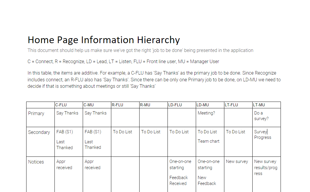
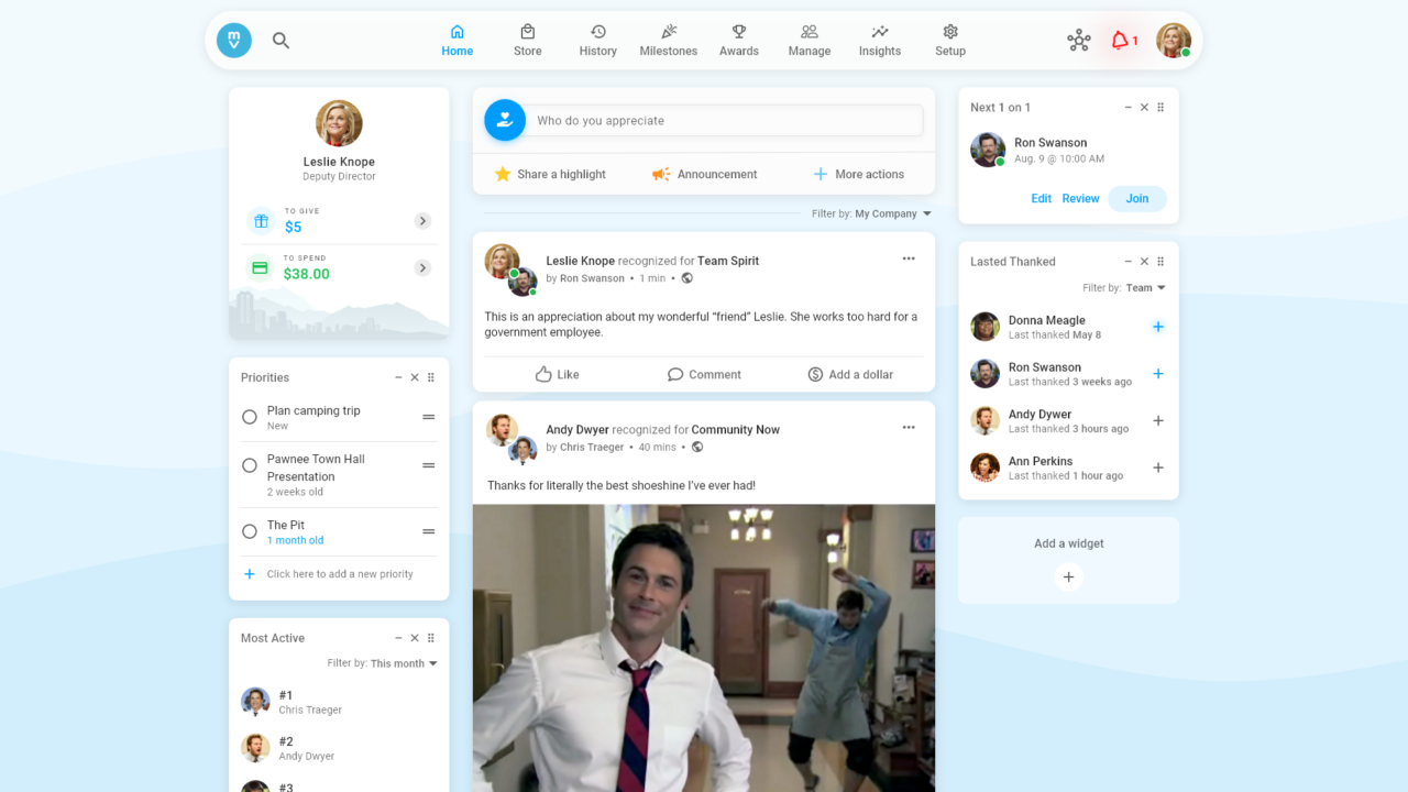
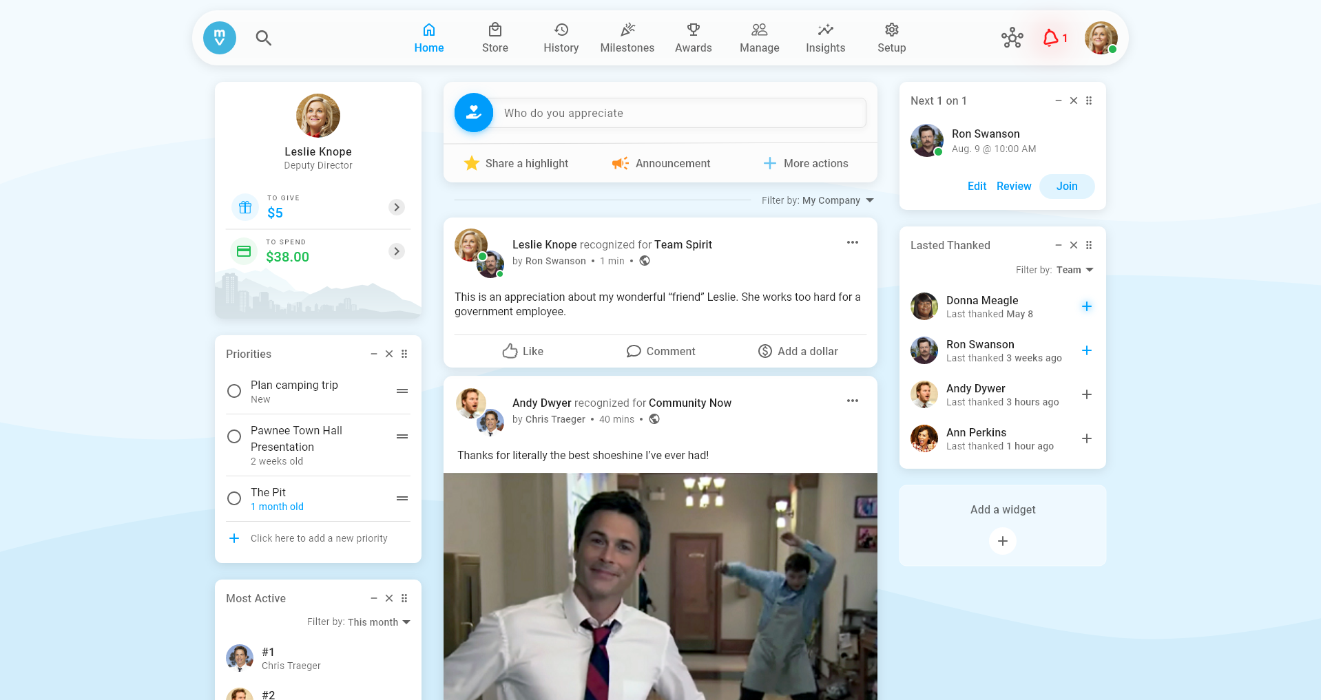
A relic of the early days of social media, Motivosity lacked modern style, interactions, and architecture which deterred customers. It had also grown into a suite of human resource products that all needed real estate on the home screen. Our vision was to design a one-stop-shop home that embraced aesthetic-usability and multiple product license types to lay a strong foundation for a rapidly evolving business.
More than
$240K
lost each year to
UX/UI complaints
Desired high-level outcomes
Home glow up
Transform the home style and experience into a delightful one.
1
Product license defaults
Optimize home layout and primary actions for each license.
2
Expandable design system
Universal design that adapts and evolves across all devices.
3
My role
I led the research, design, and testing of the home experience from May to November 2021. I worked alongside the CEO, a researcher, two product managers, seven engineers, and collaborated with the creative director.
In addition, I worked cross-departmentally with customer service, sales, and marketing for data, insights, and feedback.
I stopped working on the project after the high fidelity design phase as the project started to be built for web and mobile.
The new home is expected to launch globally, spring 2022.
Approach
Design by behaviors.
We had the data from resources like Mouseflow, heatmaps, and Google Analytics to show us what customers were doing, but we didn’t have the why they were doing them. Data is worthless without accurate interpretation.
To have the best interest of our customers at heart and establish a clear, actionable vision to differentiate Motivosity in a competitive market, we needed to understand the why behind our customer behaviors and then design in the behavioral science that drives workplace happiness.
To do this we looped the quantitative (what), the qualitative (why), and the form (How) to inform design decisions. All the while establishing behaviors, ourselves, to improve transparency, alignment, and collaboration between departments for better product execution.

What
Quantitative data from scientific publications, industry reports, sales/renewals, heatmaps, and software analytics.
Why
Qualitative data from 1 on 1 interviews with stakeholders, customer feedback, field observation, and usability tests.
How
Stakeholder meetings, surveys, interviews, rapid sketching, design mockups, prototyping, and beta releases.
Attitude & behavior insights
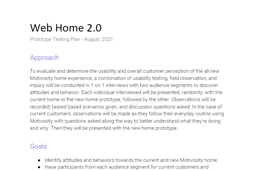
We tested the existing Motivosity home with 17 participants, divided equally as possible between our audience segments. Combining the results from the test with customer feature request frequency and quantitative data, the following insights were key in defining the final version of the home.

Discovery
Home means identity.
Customers’ joy in using Motivosity’s home came from a sense of connection to others in their organization and self-awareness of where they fit and how they were contributing to their organization. We saw frustrations and issues arise from insincere interactions and from uncertain belonging. Features that enabled personalization, self-evaluation, and genuine relationships proved huge in driving positive behaviors and happy attitudes.
”HR admins want solutions that promote their values in a visible way to affect culture change.
Virtual water cooler
The activity feed provides community by connecting employees with their organization. People like to check in on what’s happening in the company, cheer on a co-worker, or learn about a peer.
Personalization
The inability for companies to customize with their branding or for individuals to control what they see negatively impacted the experience and decreased engagement.
Authenticity
Appreciations and value initiatives had the reverse effect when customers felt they were forced or insincere. This ultimately resulted in feelings of anxiety and resentment.
Solution
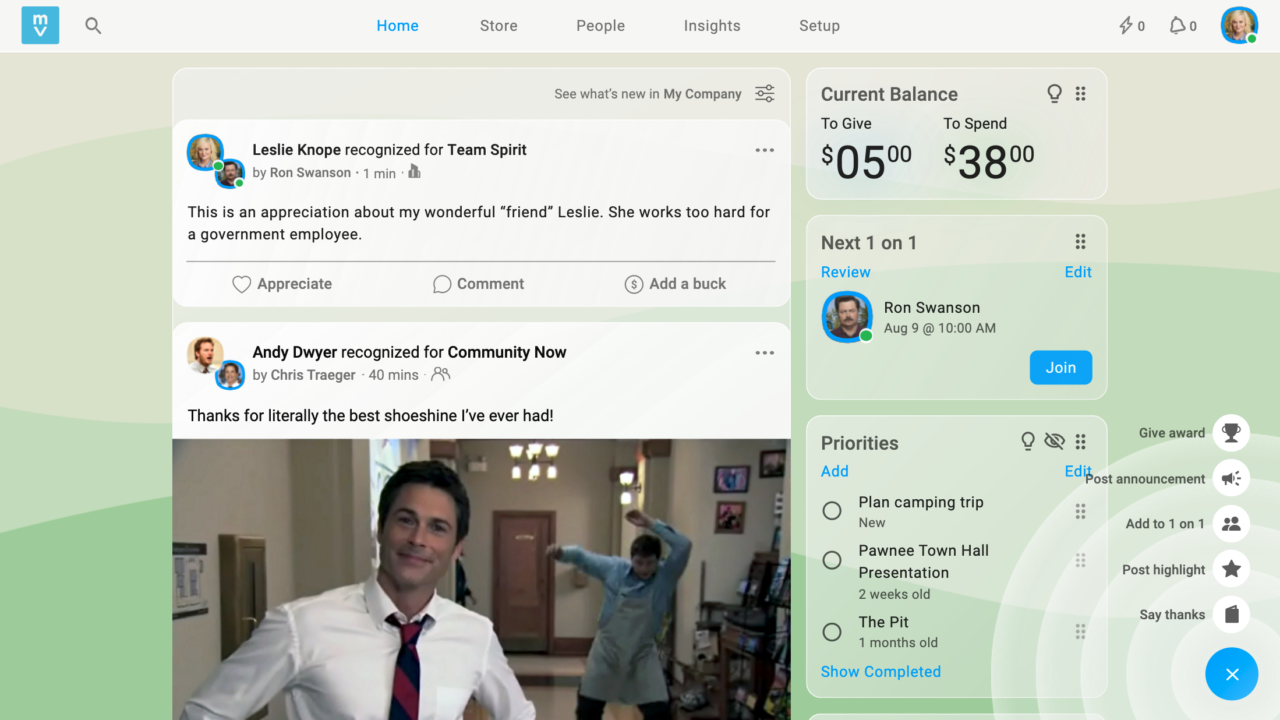
The new Motivosity home experience
In the uncertain times of disconnect and isolation, find community and belonging at work—yep, we said work—with Motivosity’s beautiful new home. Be happier in your job with understandable and actionable information tailored for you while being seen and recognized for your valuable contributions.


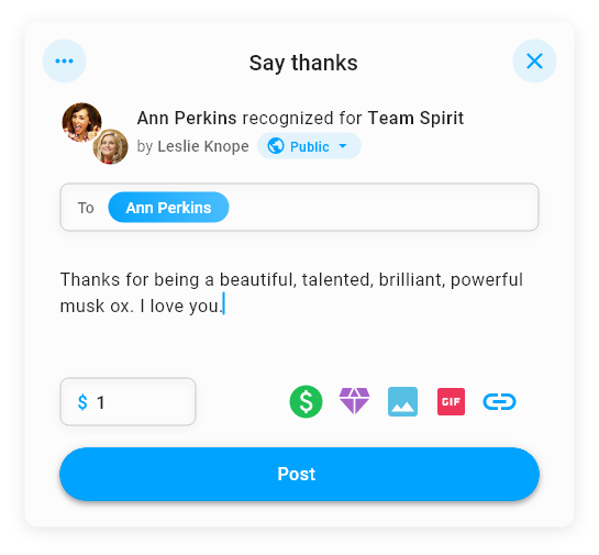
All together now
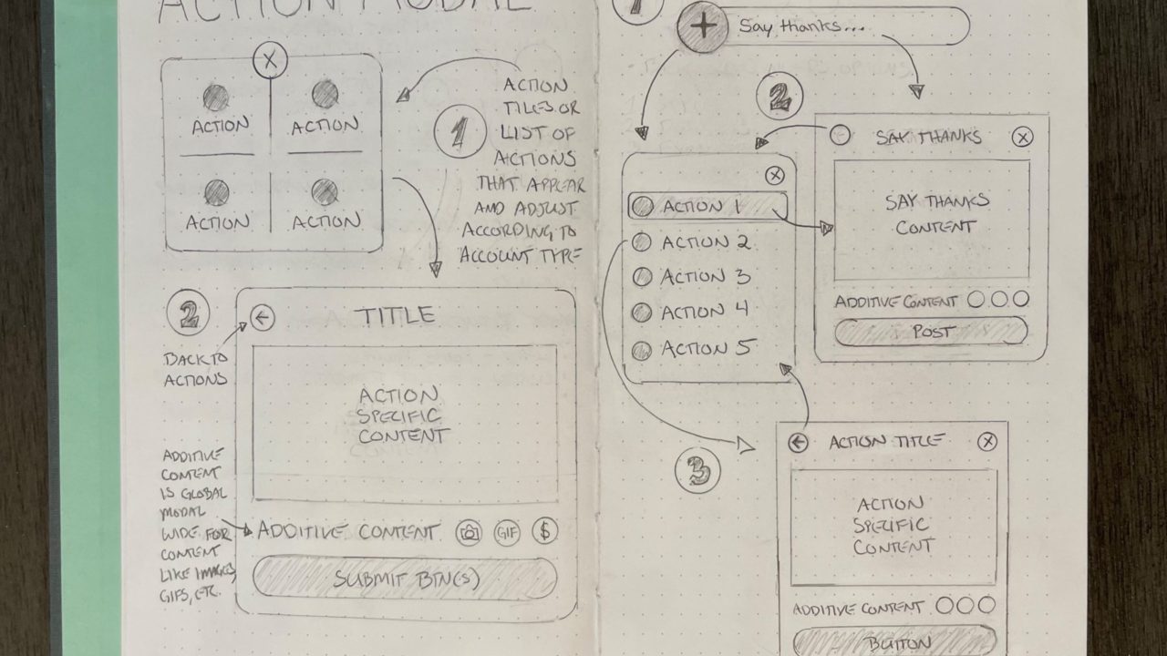
Looking to say thanks for that last-minute favor? Excited to announce Friday’s company BBQ? Do it all and more from one convenient location. The action widget puts all your favorite actions together in a familiar way so you always know what to do and control more of what you see. Sharing the cheer has never been easier.
Break free from your confines with a refreshing design that helps you come alive.
Your home. Your way.
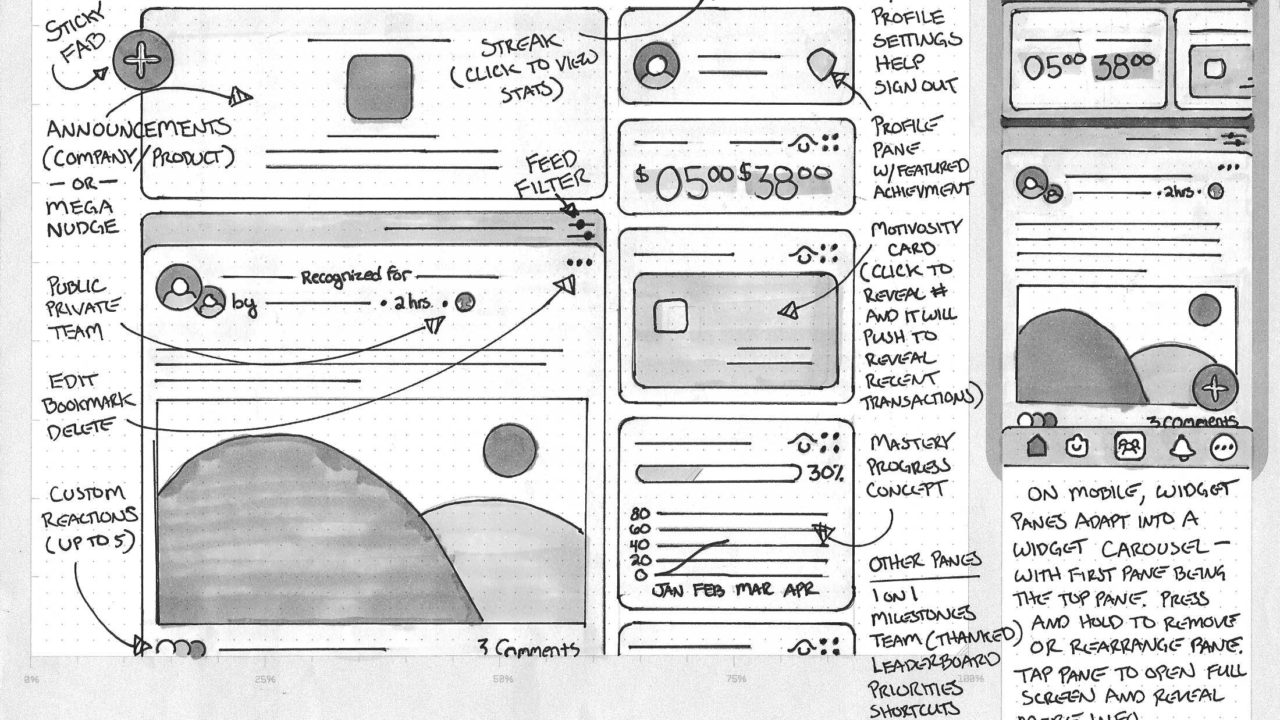
With the power of widgets, transform your home into a one-stop hub. Collapse them, reorder them, remove them, and add them. Now the most important information and tasks are one click away, right where you want them, so you can better do you.


How we got there
Swallow the elephant. One bite at a time.
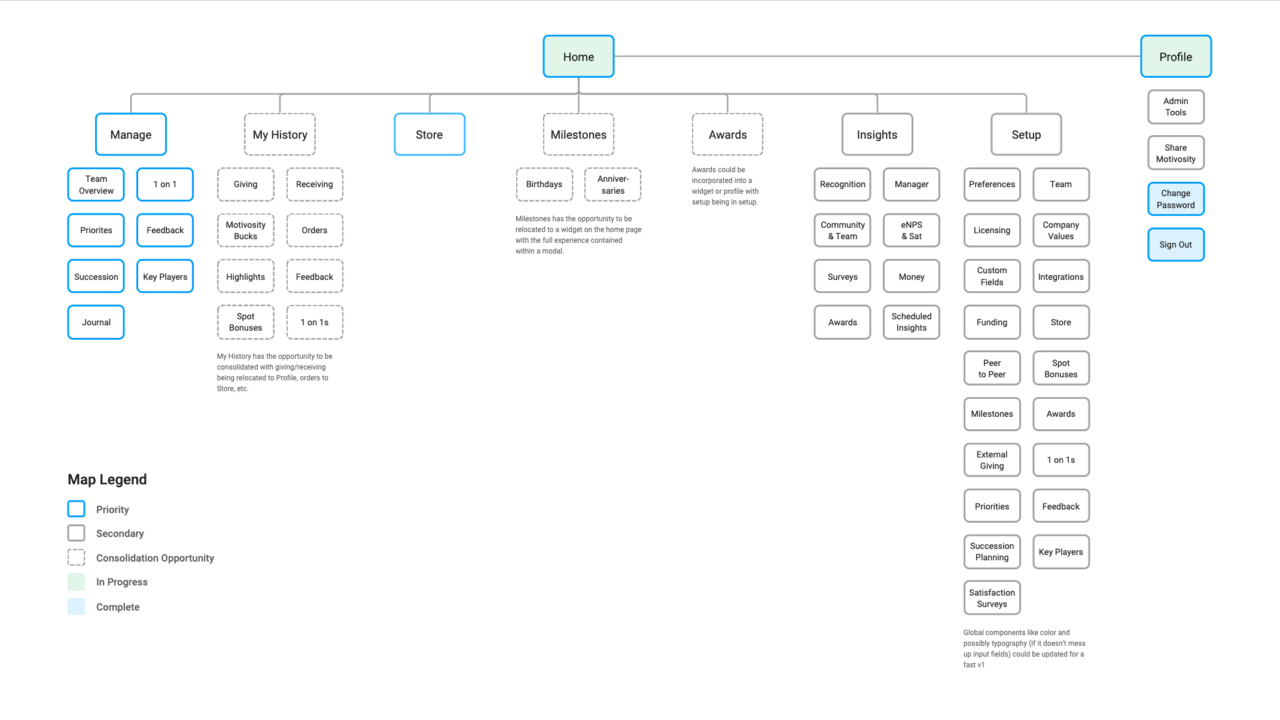
Considering the massive scope of the project and the aggressive timeline, we opted to reskin the home and platform first before introducing robust new features. This way we could lay the foundation and style to build on while responding quickly to the most urgent customer requests.
With a sitemap to prioritize, we would establish the primary jobs to be done per page. Then we would sketch to rapidly iterate before taking the best ideas to prototype. Usability testing and feedback informed the final designs before heading to production. Finally, we’d launch the new pages and features in staged releases, beginning with the home.
“This makes me want to log in to Motivosity because it just looks and feels modern and nice. I feel confident. It makes me mad that we don’t have this already, like I would love this!”
